I've been reviewing the design system now I have largely got all the words into Indesign. The real content, as expected, is creating new demands of the layout system and exposing areas for improvement.
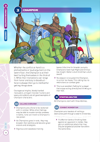
Old design

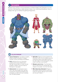
Design tweaks

I have...
- ...added horizontal dividers that span two columns in the body text (not just the section headings). This helps divide content better into chunks and adds a needed extra level in the visual hierarchy.
- ...added subtitles have been added to paragraph bullets (in some places), again to help with the scannability of the book at the table.
- ...changed the image style. While I liked the big image (and is more arresting here when presented in isolation) I went for a more game guide style presentation of the characters, this will work better in the book as a whole (and be slightly quicker to produce!). The main image is the Calling Architype, the smaller ones depict the customisation and variations possible within the rules
PS. The copy WILL have typos!

No comments:
Post a Comment